

Portuguese Tiles and the Art of the Azulejo | De Ferranti
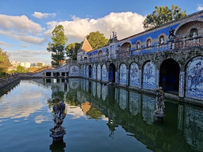
For Architects, Interior Designers and Project Teams
At De Ferranti, so much of what we do has you in mind. We know professional readers need more than attractive editorial. You need well-researched material insight that can support specification, spark design ideas, and add value to your CPD record. So we have done the research for you and turned that knowledge into something clear, useful and easy to apply.
To make that value immediate, we have also included two CPD-friendly templates at the end of the article: one for architects and one for interior designers. They are designed to help you log the learning quickly and with minimal effort.
We see architects, interior designers and project teams as important long-term partners and collaborators in the way we work, think and create.
Estimated Reading Time: 43 minutes
Portuguese azulejo tiles rarely reveal their whole story at first glance. What appears from a distance to be a continuous pattern resolves, on closer inspection, into individual brushstrokes, subtle variations in glaze and motifs whose origins reach far beyond Portugal. Elsewhere, the tiles abandon repetition altogether, becoming painted scenes that unfold across the architecture of a room. Yet long before the familiar blue-and-white compositions, the tradition drew upon the rich greens, ochres and intricate geometry of Islamic Iberia, an artistic inheritance that Portuguese craftsmen and patrons would gradually transform into something distinctly their own.
Over five centuries, azulejos have lined royal apartments, accompanied religious narratives, enlivened gardens and given city streets much of their character. Their development reflects successive encounters with Islamic Iberia, Renaissance painting, European printmaking and Chinese porcelain. Portugal absorbed these influences, but its most distinctive contribution lay in the ways tiles were composed for particular buildings.
A border might frame a doorway, a painted scene occupy the end of a room, or a repeating pattern extend across an entire elevation. For those considering decorative surfaces today, Portuguese azulejos offer a generous repertoire of colour, relief and drawing, while reminding us that selecting the tiles is only the beginning; the composition of the whole wall deserves equal care.
Before Blue and White
The word azulejo comes from an Arabic term associated with a small, polished stone or mosaic; however, its similarity to azul, the Portuguese word for blue, has encouraged a persistent misunderstanding. Early Portuguese wall tiles were often polychrome, their geometry articulated in green, ochre, brown and white.
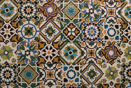
Polychrome azulejos, illustrating the variety of patterns associated with the Hispano-Moresque decorative tradition
Historically, the craft of coloured ceramic mosaic pavements first appeared in Portugal during the Middle Ages. Surviving evidence associated with Alcobaça and Leiria points to an earlier interest in geometric ceramic surfaces. The extensive glazed wall coverings for which Portugal became celebrated, however, developed more fully through contact with the Hispano-Moresque workshops of Seville and Toledo.
These workshops maintained techniques and ornamental conventions shaped by Islamic artistic practice in Iberia. In 1503, during the episcopate of Jorge de Almeida, tiles from Seville were commissioned for Coimbra's cathedral. A substantial consignment reached the royal palace at Sintra in 1508, during the reign of Manuel I. Portuguese patrons were already adapting imported ceramic designs to rooms, entrances and heraldic programmes of their own.
North Africa belongs to the wider cultural history of this ornament, but it is important to note that the documented supply route for these early commissions leads through Iberian workshops. The term Mudéjar describes the continuation and adaptation of artistic practices associated with Muslim Iberia under Christian patronage. At Sintra, inherited geometric and botanical forms appear alongside emblems of the Portuguese monarchy, in such a way that neither history disappears in the encounter.
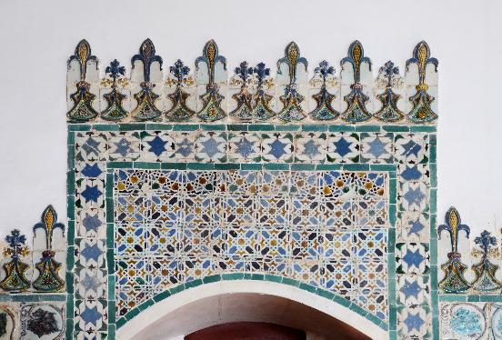
Polychrome tilework in the Moorish Room, National Palace of Sintra.
The reliance on imported tiles did not last indefinitely. By the middle of the sixteenth century, Portuguese workshops were also producing decorated ceramics. Excavations at Santo António da Charneca, south of the Tagus, uncovered a kiln and discarded tiles, providing archaeological evidence of local manufacture. This discovery adds an important dimension to the story: while the early royal commissions drew upon established Iberian workshops, Portuguese craftsmen were beginning to develop their own production.
Sintra and the Pleasure of Relief
At the National Palace of Sintra, the character of the early tilework is inseparable from its physical surface. Moulded grape leaves, tendrils and geometric motifs acquire definition through their raised contours and coloured glazes. The changing light makes the relief particularly apparent, revealing details that might be overlooked when the tiles are viewed as part of a larger decorative scheme.
The armillary sphere, associated with Manuel I, introduces a specifically royal emblem among ornamental forms inherited from the Islamic artistic traditions of Iberia. These compositions demonstrate how imported ceramic designs were adapted to the architectural and symbolic requirements of Portuguese patrons.
Another instructive setting is the Casa do Lago at Quinta da Bacalhôa, near Azeitão. Here, sixteenth-century geometric tilework forms part of a Renaissance garden in which walls, water and built structures are closely composed. In both settings, the relationship between the ceramic surface and its surroundings is as important as the individual decorative motif.
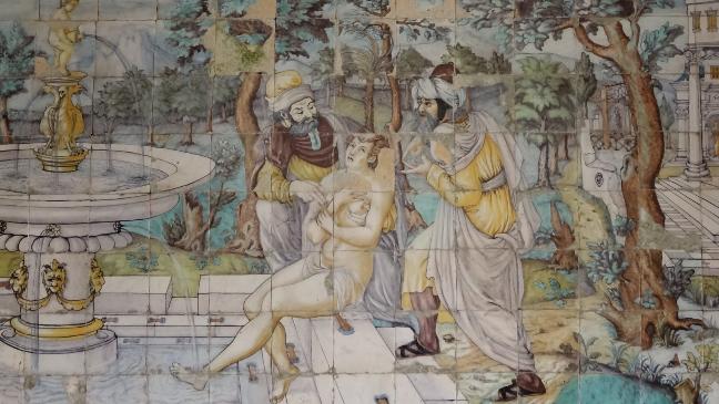
“Susanna and the Elders” panel at Casa do Lago at Quinta da Bacalhôa
The differences between these historic surfaces are rooted in their methods of manufacture as well as their decorative styles, which we will examine in the next section. Three techniques in particular help explain the development of Portuguese azulejos, from the sharply defined geometry of Hispano-Moresque ornament to the increasingly elaborate painted compositions of the Renaissance.
Corda Seca, Aresta and Majolica in Portuguese Tilemaking
Corda Seca
The corda seca technique, meaning 'dry cord', was widely used by Hispano-Moresque workshops supplying Portugal during the late fifteenth and early sixteenth centuries. The design was outlined on the ceramic surface using a greasy, glaze-repelling mixture, traditionally containing manganese. This prevented neighbouring coloured glazes from running together during firing. The resulting divisions, often visible as dark lines, allowed craftsmen to produce intricate geometric patterns incorporating several colours within a single tile. Particularly associated with Islamic decorative traditions, corda seca was well suited to interlacing shapes and repeating motifs, although applying the resist and individual glazes demanded considerable care. Surviving examples at Sintra reveal how these separately coloured areas could combine into elaborate architectural compositions.
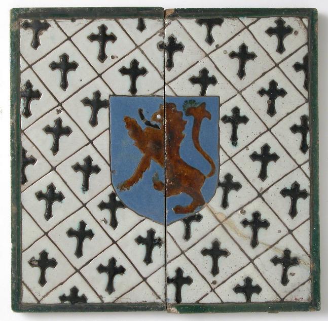
Sevillian corda seca tiles, with coloured glazes separated by resist outlines rather than moulded ridges
Aresta
The related aresta technique, also known as cuenca, achieved the separation of colours through moulded relief rather than a drawn resist. A mould was pressed into the clay while it remained soft, creating raised ridges around shallow compartments. Different coloured glazes were applied within these recesses, with the clay boundaries helping to keep them apart during firing. The use of moulds also made it possible to reproduce complex designs with greater consistency across large commissions. Unlike the comparatively flat outlines of corda seca, aresta gives the decoration a pronounced physical character. Light catches the ridges, shadows form along their edges, and the glaze settles within the recessed areas. For architects and designers, these distinctions are worth observing closely, since the appearance of relief varies considerably with the direction and intensity of light.
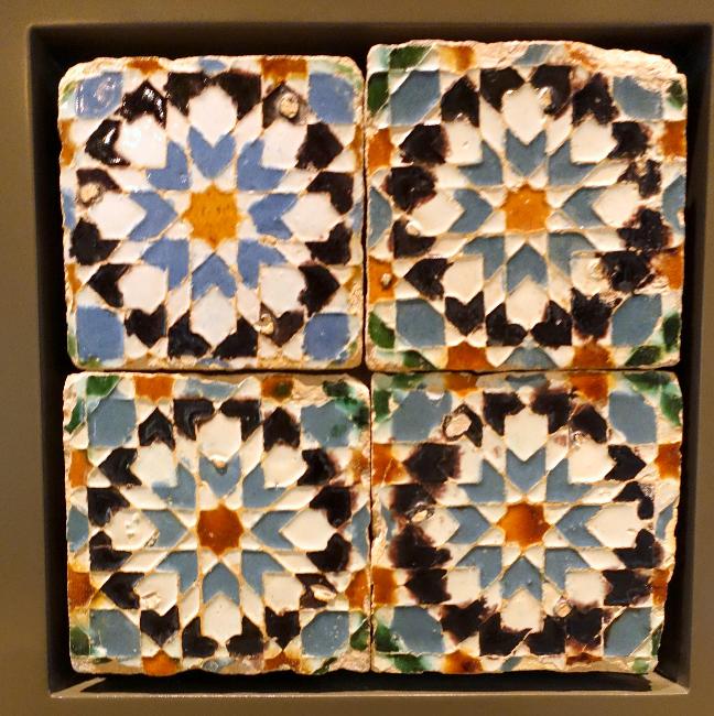
Sixteenth-century aresta tiles showing the raised clay ridges that separate coloured glazes and give the pattern its relief
Majolica
The introduction of majolica, or maiolica, during the sixteenth century brought a different approach to ceramic decoration. Developed in Italy and subsequently adopted by workshops in the Iberian Peninsula, the technique involved coating a previously fired ceramic body with an opaque white tin glaze, onto which coloured pigments were painted before a further firing. Rather than keeping colours apart through resist lines or moulded ridges, the painter could work directly across the prepared surface. This provided greater freedom for figurative subjects, architectural illusions, landscape and narrative compositions. The pigments were absorbed by the unfired glaze, demanding confident brushwork and an understanding of how colours would develop in the kiln. Although geometric ornament continued to be produced, majolica greatly expanded the possibilities of ceramic painting and helped establish the pictorial tradition that became so closely associated with Portuguese azulejos.
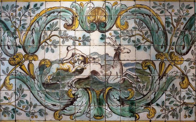
Portuguese majolica, c. 1680, National Azulejo Museum, Lisbon.
These techniques did not simply replace one another. Different approaches to ornament and manufacture continued to coexist, reflecting changing artistic tastes and the requirements of individual commissions.
When the Wall Became a Picture
The technique of majolica painting belonged to the wider tradition of tin-glazed earthenware known as faience, or faiança in Portuguese. During the second half of the sixteenth century, Lisbon became an important centre for its production, aided by the expertise of Flemish craftsmen. Its opaque white glaze allowed painters to develop increasingly ambitious figurative scenes, landscapes and architectural illusions, eventually creating pictorial compositions conceived for entire walls.
One of the remarkable survivors is Nossa Senhora da Vida, an altarpiece of about 1580, now in the National Azulejo Museum in Lisbon. Its 1,498 tiles create the impression of an elaborate structure with painted columns, niches and a central image of the Adoration of the Shepherds. Saint John and Saint Luke appear as sculpted figures within the fictive architecture. The work, traditionally attributed to Marçal de Matos, demonstrates how a ceramic wall could borrow convincingly from painting and carved decoration.
The panel was originally installed in the Church of Santo André. A real window occupied an opening in the composition, allowing daylight to reinforce the religious imagery surrounding it. The museum interprets the passage of light as an allusion to the Holy Spirit's movement towards the Virgin Mary. The position of that window was therefore integral to the original work, rather than an awkward gap to be hidden by the painter.
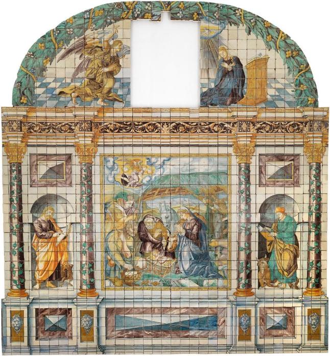
Nossa Senhora da Vida, c. 1580, National Azulejo Museum, Lisbon. The opening belonged to the original window-based composition.
It is an unusually vivid reminder that a painted tile panel must be designed for its setting. The dimensions of a wall, the presence of a window and the approach from an adjoining room affect how a composition is read. A contemporary panel may be secular, but it benefits from the same attention to proportion, sightlines and architectural interruptions.
The Room as a Ceramic Carpet
In the seventeenth century, extensive repeating Portuguese tile patterns became particularly prominent in churches and other important interiors. Known as tapetes, or carpets, they followed the compositional logic of textiles, with an ornamental field enclosed by borders and friezes. This arrangement allowed large expanses of wall to be decorated while maintaining clear relationships with doors, openings and cornices.
A complete motif might be formed from just four tiles, while more elaborate patterns required arrangements of four by four or six by six. One particularly ambitious Lisbon design, known as Marvila, extended across twelve tiles in each direction, requiring 144 individual pieces before the complete module could be repeated. Seen alone, a tile might contain only the corner of a leaf or a fragment of a scroll, with the larger composition becoming apparent only once the pieces were assembled. The distinction between the dimensions of an individual tile and the scale of its finished pattern is easily overlooked when selecting from isolated samples.
Colour remained varied. Blue shared the surface with green and yellow, while motifs drew upon textiles, tooled leather and metalwork. The ornamental fields were contained by carefully considered borders, for which Portuguese craftsmen developed a distinct vocabulary.
A friso formed a narrow frieze, typically half a tile in height; a cercadura provided a border one tile high; and a barra created a more substantial frame two tiles high. These elements could be combined to define a dado, frame an opening or bring a decorative field to a considered conclusion. Their proportions remain relevant when planning contemporary tiled elevations.
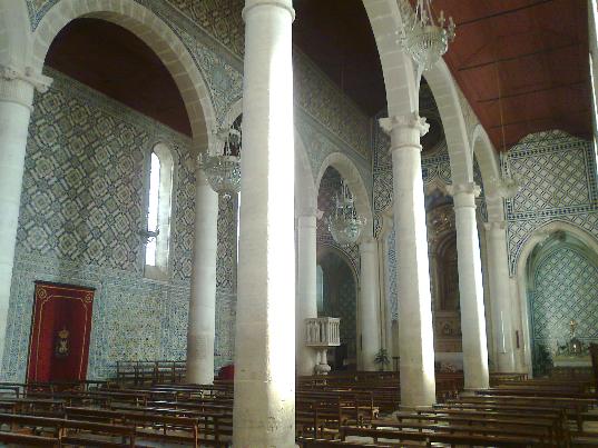
Patterned tile coverings at Santa Maria de Marvila, Santarém, frame arches and continue across the nave walls.
Figurative panels developed alongside these repeating fields. In aristocratic houses, hunting scenes, mythology and garden subjects introduced another register, sometimes playful and occasionally satirical. The historic tilework at the Palácio dos Marqueses de Fronteira provides a particularly engaging example of the taste for imagined creatures and elaborate garden scenes.
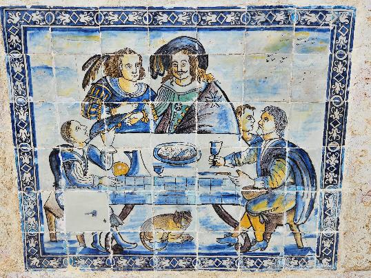
A framed figurative panel in the gardens of the Palácio dos Marqueses de Fronteira, Lisbon.
At De Ferranti, our Frontera Collection Jardim Tropical Bestiário Hand Painted Tile draws on that world of foliage, animals and water. Such a scene is most readily appreciated where the viewer can approach it, perhaps beside a quieter patterned field. It produces a different effect from an uninterrupted geometric repeat, and deciding between the two is partly a matter of how the room will be occupied.
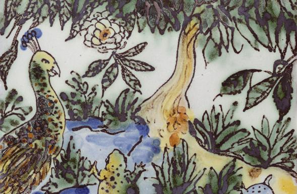
Frontera Collection – Jardim Tropical Bestiário tile, by De Ferranti
How Cobalt Changed the Story
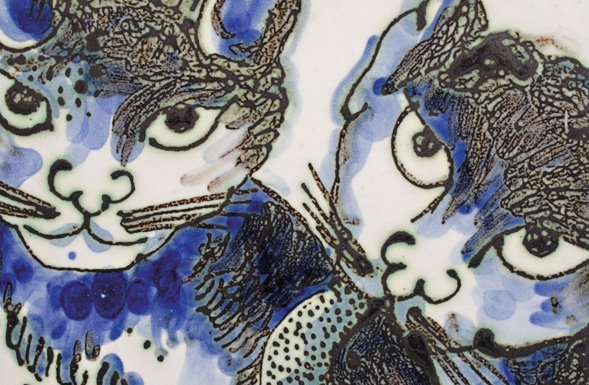
Frontera Collection – Os Gatos, by De Ferranti
The Portuguese enthusiasm for blue and white gathered momentum at the end of the seventeenth century, with Dutch tile painting an important influence. Chinese blue-and-white porcelain had already helped shape European taste, while Dutch workshops supplied both models and commissions for Portuguese patrons. The palette now so closely associated with Portugal emerged from this wider circulation of objects and ideas.
During the period called the Cycle of the Masters, conventionally dated from about 1690 to 1725, highly accomplished painters gave these compositions increasing freedom and scale. Artists such as António de Oliveira Bernardes adapted religious narratives, classical subjects and hunting scenes to the walls they were asked to cover. European engravings provided pictorial sources, but their designs had to be redrawn to suit the dimensions and openings of each commission. Some painters signed their panels, recognising tile painting as an artistic undertaking in its own right.
The apparent simplicity of cobalt on white concealed considerable painterly range. Thin washes could suggest a distant landscape; concentrated strokes brought a foreground figure or architectural frame into focus. These changes of tone remained effective across a wall assembled from many small units, yet rewarded inspection close to the surface.
The life-size figuras de convite, or invitation figures, introduced another kind of encounter between ceramic decoration and architecture. Often cut to the silhouette of a liveried servant or ceremonial guard, these painted figures stood near the entrances to reception rooms, halls and staircases. Their gestures appeared to welcome visitors, lending the tiled surface a theatrical presence. In some historic settings, the figures were deliberately positioned to remain unseen until the visitor had entered, making their discovery part of the experience of moving through the building.
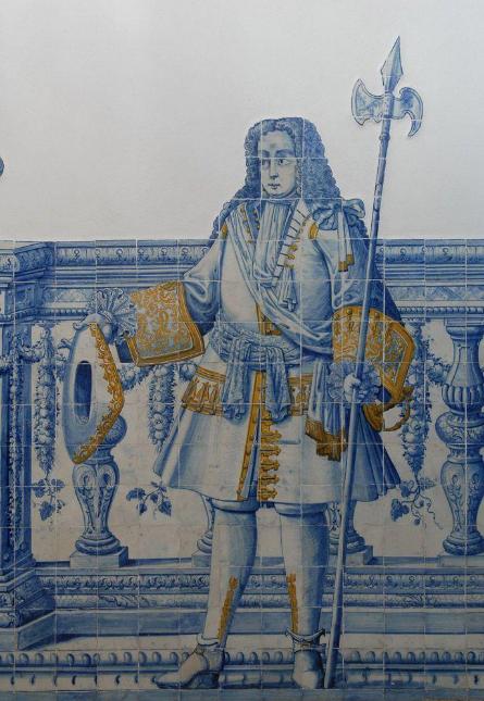
A life-size figura de convite, c. 1730, at the Palácio da Mitra.
Blue-and-white decoration can provide a coherent palette for a contemporary room, but narrative panels and floral repeats make different demands on the space. A large painted scene often benefits from a clear sightline and sufficient viewing distance, while a repeating pattern can carry colour across successive walls without depending on a single focal point. Both approaches should be considered in relation to the proportions, lighting and adjoining materials of the intended interior.
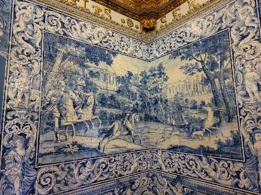
Blue-and-white narrative panels in Sintra’s Sala dos Brasões continue around the room’s corners.
The influence of Chinese blue-and-white porcelain extended beyond European workshops. Ottoman potters also responded to imported Chinese ceramics, although Iznik developed its own materials, palette and ornamental traditions. That parallel offers a useful point of comparison with Portuguese azulejos without implying a direct line of influence between them.
Iznik Tiles and the Wider Ceramic World
During the sixteenth century, the workshops of Iznik, in north-western Anatolia, supplied the Ottoman court with decorative tiles for palaces and mosques, particularly in Istanbul. Like Portuguese azulejos, these ceramics were conceived as part of their architectural surroundings, with elaborate patterns, carefully arranged repeats and richly painted ornament. Yet their materials, manufacturing techniques and artistic development were distinctly different.
Mature Iznik tiles were generally made from stonepaste, a silica-rich ceramic body, with decoration painted beneath a transparent glaze. Portuguese painted faience used tin-glazed earthenware, whereas earlier Hispano-Moresque tiles employed techniques such as corda seca and aresta to separate coloured glazes. These methods produce different effects of colour and surface, and their visual affinities do not make the ceramics technically interchangeable.
By the middle of the sixteenth century, Iznik tile painters had extended the palette to turquoise, green and a distinctive raised red, often arranging tulips, carnations and other stylised flowers in vigorous compositions. A tile made around 1578 for the decoration of Sultan Murad III's quarters, now in the Metropolitan Museum of Art, offers a particularly clear lesson in the logic of repetition. Its floral and cloud-band motifs are cut off at the edges; neighbouring tiles complete the design.
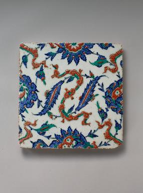
Floral and cloud-band tile, Iznik, c. 1578. The motifs continue beyond the edges. The Metropolitan Museum of Art
However, the comparison with Portuguese ceramic carpets is instructive. In both, the single tile is only a portion of the intended image, and borders and repeats determine how a larger surface is experienced. Yet a shared compositional method does not imply that Portuguese azulejos descended directly from Ottoman Iznik.
Our Islamic & Iznik Ceramic Tile Art collection provides further examples of decorative schemes conceived through repeating ceramic units. Comparing the traditions can help designers understand how motifs meet at joints, how borders contain ornament and how painted patterns behave across an entire wall, while recognising the distinct history of each.
From Palace Rooms to City Streets

Ottoman Tulip Vine Tile, by De Ferranti
After the Lisbon earthquake of 1755, repeating tile designs provided practical, relatively economical decoration for buildings reconstructed under the Marquis of Pombal. The patterns associated with this rebuilding became known as pombalinos. During the nineteenth century, expanding urban production encouraged the use of glazed tiles across entire façades, bringing colour and repeat into the everyday streetscape.
The change of setting altered how tiles were seen. A pattern on a tall building needed to register from the opposite pavement, while relief on northern Portuguese façades could produce strong shadows under changing daylight. Individual buildings gained recognisable surfaces, but the effect was cumulative: whole streets acquired their character through adjoining expanses of ceramic ornament.
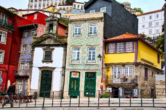
Tiled façades contribute to the colour and character of adjoining buildings in Porto.
Tile continued to develop as an artistic medium in the twentieth century. Lisbon's Metro brought modern painting into stations used every day. At Cidade Universitária, Manuel Cargaleiro translated an earlier gouache by Maria Helena Vieira da Silva into azulejo, while Júlio Pomar created decorative tilework for Alto dos Moinhos. Ceramic decoration was no longer confined to royal residences, churches or the houses of wealthy patrons.
The tradition had also travelled far beyond Portugal, reaching Brazil and India, where Portuguese tiles were adapted to different architectural settings and artistic tastes. In twentieth-century Brazil, ceramic decoration found a particularly expressive role in modernist architecture. Candido Portinari created tile panels for Rio de Janeiro's Gustavo Capanema Palace, while Athos Bulcão developed striking geometric compositions for Brasília. Their work demonstrates how an inherited decorative tradition could become a thoroughly contemporary architectural language.
This breadth of application makes the tradition particularly useful to architects and interior designers today. Portuguese azulejos have accompanied Renaissance gardens, Baroque churches, nineteenth-century façades and modern transport architecture. Their history offers precedents for different scales and settings, without prescribing a single historical style for a new project.
The wider De Ferranti Ceramics – All Disciplines collection extends this exploration to other decorative traditions, allowing architects and designers to consider different approaches to relief, glaze, painted ornament and contemporary ceramic design.
Working With Contemporary Azulejos
A handmade surface often first appeals through its individual details: a brushstroke, a softened edge or a small change in glaze. Yet it will usually be seen as part of a much larger field, and the most successful schemes consider both experiences, giving the individual tile sufficient character without losing the coherence of the completed wall.
The De Ferranti Azulejo Collections
The continuing appeal of Portuguese azulejos owes much to the survival of traditional ceramic craftsmanship. Historic patterns, moulded relief and hand-applied glazes provide a rich vocabulary for contemporary interiors, particularly when their original character is understood and thoughtfully adapted to a new architectural setting.
Two collections at De Ferranti illustrate how decorative references from sixteenth-century Portugal can find renewed expression in newly made tiles.
Our Sintra Collection - King Sebastian Grape Leaf Azulejo draws upon the historic tilework in King Sebastian's bedchamber at the National Palace of Sintra. The moulded grape leaf sits within a softly defined ceramic field, while variations in green, teal and ivory glaze give depth to its raised contours. The original design belongs to the decorative traditions of the early sixteenth century, when botanical ornament, geometric repetition and royal symbolism were brought together in Portuguese interiors. In contemporary production, the character of the relief remains particularly apparent under changing light, allowing even a relatively small tiled area to reveal considerable detail.
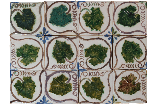
De Ferranti’s King Sebastian Grape Leaf Tiles – Sintra collection
At Quinta da Bacalhôa, near Azeitão, the sixteenth-century Casa do Lago provides another remarkable example of decorative ceramics integrated with Renaissance architecture. Our Bacalhôa Collection Geometric Relief Tiles take their inspiration from these historic wall coverings, reproducing their characteristic relief and polychrome decoration. Green, blue-green, ochre and aged cream glazes settle around the moulded forms, giving the repeated pattern a tactile quality. The relationship between ceramic ornament, natural light and the garden setting at Casa do Lago remains a useful reference when considering these tiles for contemporary interiors.
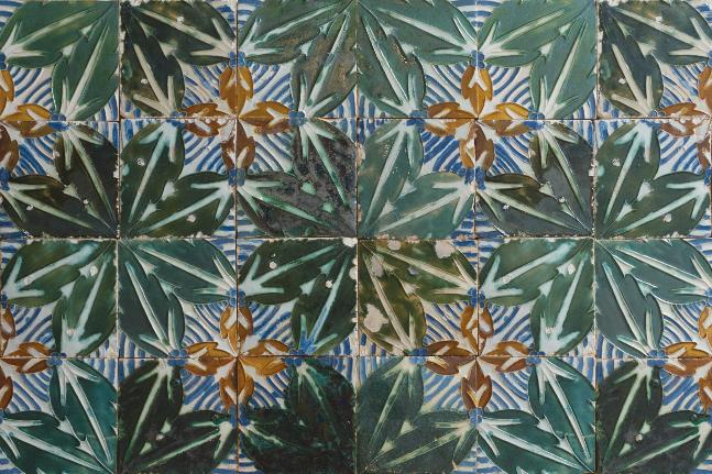
De Ferranti’s Geometric Relief Tiles – Casa do Lago collection
Both our collections demonstrate how historic decorative surfaces can be adapted without requiring the surrounding room to imitate a period interior. In terms of materials, ceramic relief tiles can sit comfortably alongside plain plaster, timber or stone, where their variation in colour and modelling becomes more apparent.
For architects and interior designers, the most important considerations are the scale of the repeat, the treatment of borders and edges, and the effect of lighting across the completed surface. The individuality of the handmade finish must also be considered alongside the overall consistency of the installation.
The Craft and Character of De Ferranti Azulejos
In the De Ferranti azulejo tile collection, we work with a traditional studio north of Lisbon whose craftspeople also undertake the restoration of historic tiles. That experience informs their attention to ceramic bodies, relief and painted decoration. It should not, however, be confused with a claim that every newly produced tile is an antique or an exact reproduction of an original.
Our Sintra Collection Blue Sponged Mottled Tile refers to the traditional azulejo esponjado technique, in which pigment applied with a sponge creates a softly mottled surface. Sponge decoration has historical precedents in eighteenth-century Portuguese tilemaking, when craftsmen used it to suggest clouds and the foliage of trees. In our contemporary interpretation, shifting blues introduce tonal movement without the need for an elaborate figurative design. Some finishes within the collection are also deliberately distressed or patinated. Such treatments can suggest the appearance of age, but the date and provenance of a tile remain separate considerations.
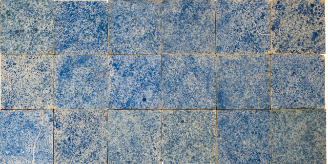
Blue Mottled Sponge Tile, De Ferranti
Whichever the technique behind a particular hand-painted tile, variations in line, colour and surface are to be expected. One brushstroke may be denser than another, or glaze may pool beside a moulded ridge. A group of adjoining samples conveys the cumulative effect more faithfully than a single tile, particularly when the surface will cover a substantial elevation. For a different approach to this relationship between handwork and repeated pattern, our Ceramics by Neisha Crosland collection offers a useful comparison.
Having now examined the history of Portuguese azulejos, and their contemporary applications through some of the De Ferranti collections, we shall turn to the finer details of specifying and installing them, so that designers and architects are able to make informed decisions based on decades of De Ferranti’s thorough research and work with this fascinating medium.
A Practical Guide to Specifying and Installing Portuguese Azulejos
Planning the Pattern and Setting Out
The successful specification of Portuguese azulejos begins with understanding how the decorative composition will occupy the intended space. A repeating geometric pattern, moulded relief tile or hand-painted panel should be assessed across the complete wall elevation, with particular attention to scale, orientation and the relationship with surrounding architectural features.
Before installation, setting-out drawings should identify starting points, borders, corners, openings and fittings. For patterns assembled from several tiles, the placement of complete motifs and unavoidable cuts requires particular care. An agreed sample panel, showing the intended arrangement and joint widths, provides a useful reference for both the designer and installer.
We also recommend confirming quantities before ordering, with a suitable allowance for cutting, breakages and future repairs. Where tiles are supplied in manufacturing batches, references, dimensions and batch compatibility should be checked before installation begins.
Assessing Colour, Glaze and Relief
Hand-painted and relief tiles may exhibit differences in colour, glaze thickness, surface texture and dimensional consistency. These variations contribute to their character, but their appearance across a completed wall can differ considerably from that of an isolated sample.
At De Ferranti, we recommend assessing several adjoining tiles under lighting conditions representative of the proposed installation. Glazed surfaces respond to both daylight and artificial illumination, while raised decoration introduces shadows that change according to the position of the light. Samples should also be viewed alongside neighbouring materials, including stone, plaster, timber and metalwork.
Where tonal variation is expected, tiles should be distributed thoughtfully across the installation rather than grouped inadvertently by shade. Mixing pieces from different boxes within a compatible manufacturing batch can help achieve a balanced appearance, although the appropriate approach should be confirmed for the selected product.
Substrate Preparation and Fixing
A stable, suitably prepared substrate is essential to the successful installation of decorative ceramics. Before fixing begins, the surface should be assessed for flatness, structural stability, moisture and the presence of dust, grease or other substances that could interfere with adhesion.
The fixing method must be appropriate to the tile's ceramic body, dimensions, weight and intended application. Adhesive selection should also account for the substrate and the environmental conditions to which the finished installation will be exposed. Larger or heavier tiles may require particular attention to adhesive coverage, with the fixing system specified to avoid unsupported areas beneath the ceramic.
In renovation projects, the combined thickness of tile, adhesive and any required preparation layers should be considered early, particularly where the new surface meets existing finishes, joinery or architectural fittings. We recommend that the complete fixing system is agreed with an experienced ceramic installer before work begins.
Grout Joints, Movement and Edge Details
Grout joints perform both technical and decorative functions. Their width and colour influence the appearance of a tiled surface, particularly where a design depends on the continuity of a painted scene or the alignment of repeated motifs.
A contrasting grout can emphasise the individual ceramic units, while a closer tonal match may allow the decoration to read more continuously. Joint widths must nevertheless accommodate the dimensional tolerances of the selected tiles and the requirements of the installation. Handmade ceramics should not automatically be laid with the narrow joints sometimes associated with precision-manufactured products.
Movement joints must also be considered wherever the installation requires accommodation for changes in temperature, moisture or movement in the supporting structure. Their positions should be coordinated with the decorative layout, including changes of plane, corners and junctions with adjoining materials.
Cutting and drilling glazed or relief tiles demand suitable specialist equipment and careful handling. Where possible, penetrations and exposed edges should be resolved during setting out to avoid unnecessarily interrupting important decorative elements.
Confirming Technical Performance and Intended Application
The historic use of Portuguese azulejos on façades, in gardens and within religious buildings offers valuable architectural precedent, but does not establish the suitability of every contemporary tile for the same conditions.
Before specifying a product, architects and designers should obtain its relevant technical information, including dimensions, manufacturing tolerances, water absorption and any performance characteristics required by the proposed application. Exterior installations may require confirmation of frost resistance, while floors demand consideration of slip resistance, mechanical performance and expected levels of use.
Bathrooms, showers and other wet areas require particular care. A glazed decorative surface should not be assumed to provide waterproofing on its own. Where necessary, an appropriate waterproofing system must be incorporated beneath the tiles, with adhesives, grout and movement joints selected for the conditions.
Ceramic products that appear similar may have different bodies, manufacturing methods and technical properties. We therefore recommend confirming the suitability of the exact product rather than relying on the appearance or historical precedent of the design.
Cleaning, Maintenance and Final Approval
Careful cleaning during and immediately after installation helps preserve the appearance of hand-painted and glazed ceramics. Adhesive and grout residues should be removed using methods appropriate to the selected finish, without damaging the decorative surface or disturbing newly completed joints.
Abrasive tools, aggressive cleaning agents and unsuitable acidic products should generally be avoided unless their compatibility has been expressly confirmed. Relief tiles may require additional attention around moulded edges and recessed areas, where installation residues can accumulate.
For routine maintenance, we recommend suitable ceramic-compatible cleaning products, with any sealing or protective treatment confirmed against the particular tile and glaze. The maintenance requirements should be communicated to the client as part of the completed specification.
Before final approval, the project team should review the agreed samples, setting-out drawings, fixing system, grout and movement-joint details, and relevant technical information. At De Ferranti, we recommend engaging installers experienced in decorative ceramics, particularly where handmade variation, complex repeats or hand-painted compositions demand careful coordination.
The aim is to preserve the character of the chosen tiles through informed specification and workmanship, with every detail considered in relation to its architectural setting. When azulejos form part of a historic building, that same attention becomes a matter of conservation, extending beyond the individual ceramic piece to the preservation of the composition as a whole.
Stolen Portuguese Tiles and the Importance of Keeping the History in Place
Historic Portuguese azulejos are admired for their craftsmanship, but their value often extends well beyond the individual tile. A decorative fragment may be beautiful in isolation, yet it was frequently conceived as part of a much larger arrangement, whether a repeating façade, a religious narrative or an elaborate interior. Removing it can interrupt a pattern that has survived for centuries, leaving a gap in the architecture as well as in its history.
The theft and unauthorised sale of historic tiles have long presented a challenge in Portugal. A Mirror travel report warning visitors about old tiles offered for sale without clear provenance brought renewed attention to the problem, particularly where tourists may be unaware of how such pieces reached the market. The distinction is an important one: a tile legitimately removed and documented during an authorised intervention is quite different from one taken from a building without permission.
Founded in 2007 through an initiative of the Portuguese Judiciary Police Museum, the SOS Azulejo project has worked to combat theft, vandalism and neglect through cooperation with cultural institutions, police forces and local authorities. Its activities include identifying stolen tiles, encouraging preventive conservation and raising awareness of the importance of keeping decorative ceramic schemes intact. This work also contributed to greater legal protection. In 2017, Portugal introduced legislation strengthening controls over the demolition of tiled façades and building works involving the removal of façade tiles, recognising their significance to the country's architectural heritage.
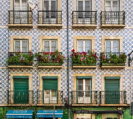
A patterned azulejo façade in Rua de São Bento, Lisbon: individual tiles form part of a continuous architectural surface.
For anyone considering the purchase of genuine antique azulejos, provenance therefore deserves as much attention as artistic quality. A worn edge, remnants of old mortar or the appearance of considerable age cannot establish that a tile was lawfully removed. Documentation of its origin, previous ownership and circumstances of removal provides a more reliable basis for assessing a purchase. Nor does the presence of historic material on the market necessarily imply wrongdoing; the essential distinction is between legitimate, traceable material and pieces whose history cannot be satisfactorily explained.
Contemporary production offers another way to appreciate this inheritance. New tiles, such as those at De Ferranti, can draw upon historical patterns, traditional glazes and methods of decoration without disturbing surviving architectural schemes. Equally, where original tilework remains in place, careful conservation allows the relationship between its individual parts to be understood as its makers intended.
Few interiors demonstrate the importance of that relationship more clearly than the Sala dos Brasões at the National Palace of Sintra. Beneath its sixteenth-century heraldic ceiling, the later blue-and-white ceramic panels bring together expansive painted narratives, smaller decorative details and elaborate ornamental frames. Their compositions respond to the corners, doorways and proportions of the room in ways that no isolated tile could adequately convey. As a visual case study, the photographs that follow offer a closer examination of these details, revealing how the character of the whole interior depends upon the thoughtful arrangement of its individual parts.
A Closer Look at the Sala dos Brasões
At the National Palace of Sintra, the Sala dos Brasões rewards looking beyond the individual scene to the arrangement of the entire room. Its blue-and-white wall panels form a later decorative layer beneath the earlier heraldic ceiling, bringing a different palette and pictorial language into the interior. Across these tiled surfaces, large landscapes give way to smaller painted episodes, while elaborate borders negotiate the building’s corners and openings. Alvaro de Ferranti’s photographs follow those changes of scale, revealing how the ceramic decoration holds together as architecture while offering remarkably intimate passages of painting.
Photographs: Alvaro de Ferranti.
Painted Narratives and Their Decorative Details
In the equestrian panel, riders and trees occupy a broad pictorial field enclosed by animated scrollwork. The framing establishes the scene’s prominence, yet the smaller landscape beneath it gives the eye somewhere else to pause as we approach the wall.
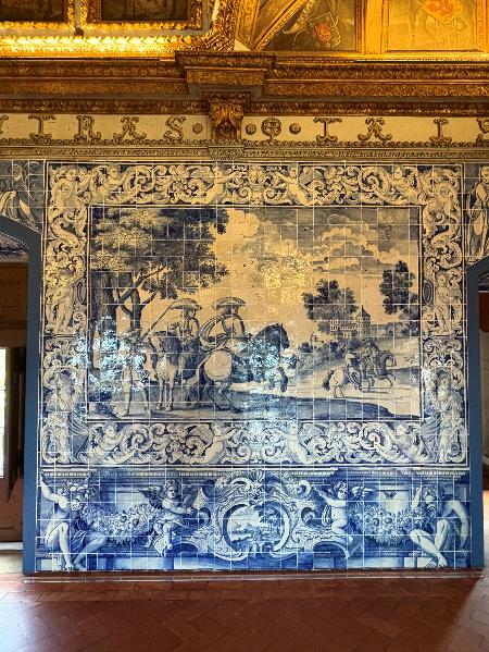
An equestrian scene framed by painted ornament, with a smaller landscape set beneath the principal composition.
Seen closely, that miniature landscape has its own depth: pale washes suggest distant ground, while darker cobalt strokes describe trees and the water’s edge. The Baroque cartouche gathers these delicate marks within a much bolder ornamental outline.
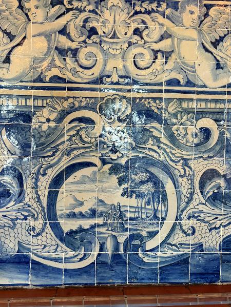
A miniature landscape within a Baroque cartouche, its depth suggested by finely varied tonal cobalt brushwork.
Beside it, a winged figure and floral garland demonstrate the painter’s range. Firm contours distinguish the figure from the surrounding foliage, while shaded petals and curling leaves give the blue-and-white surface a sense of volume.
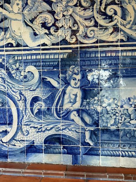
A winged figure, foliage and floral garlands reveal the expressive handling of cobalt blue across the tiled surface.
How the Decoration Turns the Corner
At a corner, adjoining hunting scenes remain distinct pictures, but their borders establish a continuous decorative setting. The horizontal bands meet across the change of plane, allowing the eye to follow the room’s geometry without losing the rhythm of the painted compositions.
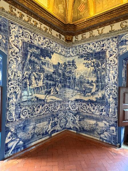
Hunting scenes meet on adjoining walls, linked by painted borders that continue around the room’s corner.
Below the main scenes, another cartouche encloses a miniature architectural view. Its surrounding scrollwork carries the ornamental language towards the junction, making a small episode part of the wider arrangement rather than an isolated embellishment.
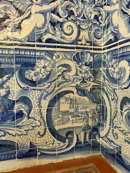
A miniature architectural scene sits within a cartouche whose surrounding scrollwork extends towards the adjoining wall.
The floral detail shows this relationship particularly clearly. Garlands cross the junction beneath illusionistic architectural framing; painted highlights and shadows suggest projecting mouldings. This trompe-l’œil is an effect of painting on the tiled surface, distinct from actual moulded ceramic relief.
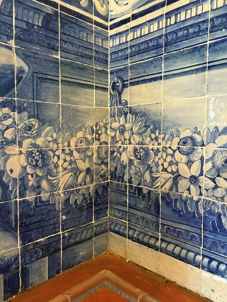
Floral garlands follow the corner beneath painted mouldings, a trompe-l’œil effect created through shading
Framing Doorways and Architectural Openings
A doorway changes the proportions available to the painter, and here the decoration responds by concentrating ornament around the opening. Tall painted figures and scrolling forms occupy the space above its arched head, connecting the neighbouring scenes without obscuring the threshold.
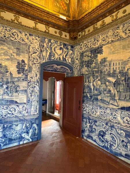
A doorway sits between narrative panels, its arched opening framed by painted figures and elaborate scrollwork.
The closer view reveals how carefully the decoration follows the opening. Painted borders define its edges, and ornament continues across the tiled underside of the arch, bringing detail into the passage between rooms.
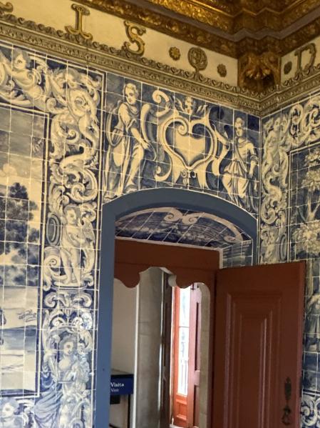
Detail of the same doorway, showing painted borders and ornament continuing across the tiled underside of the arch.
At the second opening, glazed doors sit within a differently proportioned surround. Narrow ornamental strips frame the sides, while figures and a central cartouche occupy the panel above. The shared blue-and-white palette accommodates this variation without making every opening identical.
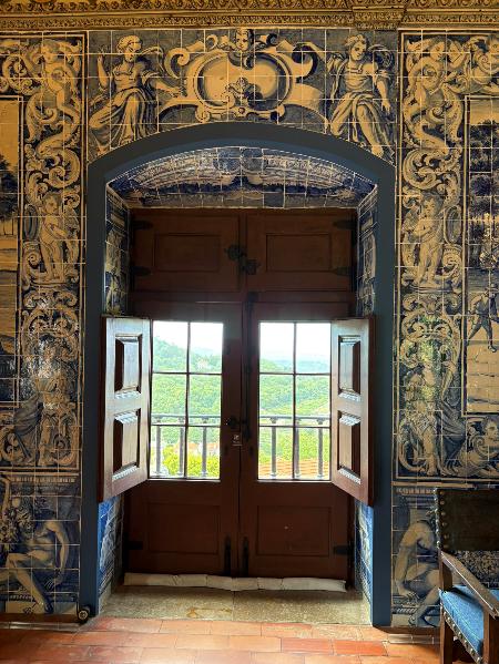
Glazed doors occupy a second opening, framed by narrow ornamental borders and a richly painted panel above.
These photographs invite us to consider a ceramic scheme through both close observation and movement around a room. A single tile can reveal the painter’s touch; the complete setting shows how that touch contributes to the character and proportions of an interior.
A Tradition That Keeps Finding New Rooms
The Sala dos Brasões offers a fitting conclusion to this history. Its painted scenes gain coherence from their surrounding borders, the corners they traverse and the openings they accommodate. Similar concerns with proportion and setting can be traced through the earlier relief tiles of Sintra, the ceramic carpets of the seventeenth century and the decorative schemes of later buildings. Although their methods and appearances differ, each demonstrates how the placement of individual tiles contributes to the character of a complete interior.
Our Portuguese Tiles – Azulejos collection brings several of these histories into contemporary production, from the shallow relief of the Sintra designs to painted and sponged surfaces. For an architect, designer or homeowner, the most rewarding choice begins with the material itself and continues through the drawing, sampling and placement of the finished work. We welcome enquiries about samples, quantities, lead times and technical suitability for a particular project.
CPD Template for Architects
CPD Template for Architects
Logging This as CPD
This article may be suitable for recording as self-directed or unstructured CPD where relevant to your professional responsibilities and the requirements of your professional body.
The following template provides a suggested framework for documenting your learning. Your completed record should reflect your own observations, professional interests and the relevance of the material to your practice.
Suggested Core Topic
The history, craftsmanship, architectural integration, conservation and technical specification of Portuguese azulejos, from their Hispano-Moresque origins to contemporary decorative ceramic applications.
Suggested Learning Format
Self-directed reading and examination of historical, architectural and technical examples.
Estimated Reading Time
Approximately 43 minutes.
This Article Covered
- Historical origins and cultural exchange: The development of Portuguese azulejos from medieval ceramic pavements and Hispano-Moresque imports to the establishment of Portuguese manufacture. This included early commissions for Coimbra and Sintra, the influence of Islamic Iberian ornament and archaeological evidence from Santo António da Charneca.
- Traditional manufacturing techniques: The distinctions between corda seca, aresta and majolica, including the use of resist lines, moulded clay ridges and painting on an opaque tin-glazed surface. The relationship between majolica and Portuguese faience (faiança) was considered alongside the different decorative possibilities of these methods.
- Pictorial decoration and architectural setting: The development of Renaissance ceramic painting, particularly Nossa Senhora da Vida, in which a real window formed part of the religious composition. The example demonstrated the importance of integrating pictorial decoration with architectural openings, proportions and sightlines.
- Pattern modules and decorative framing: Seventeenth-century ceramic carpets, or tapetes, including the 144-tile Marvila repeat, and the use of friso, cercadura and barra to define fields of ornament. These examples demonstrated how complete patterns, borders and individual ceramic units relate to the dimensions of a wall.
- Blue-and-white decoration and international influences: The influence of Chinese porcelain and Dutch workshops, the Cycle of the Masters and the development of figuras de convite. The comparison with Ottoman Iznik distinguished similarities in decorative composition from differences in ceramic bodies, manufacturing techniques and historical development.
- Architectural applications beyond Portugal: The development of glazed façades, public interiors and modern ceramic decoration, including Portuguese influences in Brazil and the architectural work of Candido Portinari and Athos Bulcão.
- Contemporary ceramic materials: The interpretation of historic designs through De Ferranti's Sintra and Bacalhôa collections, including moulded relief, hand-applied glazes and sponged finishes. The discussion distinguished newly manufactured tiles, intentionally aged surfaces and genuinely historic material.
- Technical specification and installation: Setting-out drawings, pattern alignment, representative samples, dimensional tolerances, substrate preparation, compatible fixing materials, grout and movement joints, waterproofing, cleaning and maintenance. The article also considered the importance of confirming product-specific performance for floors, wet areas and external installations.
- Conservation and provenance: The significance of preserving historic tilework as part of a building's architectural fabric, the work of SOS Azulejo, and the need to establish legitimate provenance before acquiring or removing antique ceramics.
- Photographic architectural case study: Álvaro de Ferranti's photographs of the Sala dos Brasões at the National Palace of Sintra, examining how eighteenth-century painted tile panels accommodate corners, doorways and changes of plane through continuous borders, illusionistic ornament and carefully arranged narrative compositions.
Suggested CPD Record Summary
This article developed my understanding of Portuguese azulejos as an architectural material shaped by cultural exchange, evolving manufacturing techniques and changing relationships between decoration and buildings.
The historical discussion clarified the development from imported Hispano-Moresque ceramics to Portuguese production and the emergence of increasingly elaborate painted compositions. Comparing corda seca, aresta and majolica helped distinguish their methods of manufacture and their effects on colour, relief and pictorial detail. I also gained a clearer understanding of how majolica painting relates to the wider tradition of tin-glazed faience.
The examples of ceramic carpets and narrative panels reinforced the importance of designing a tiled surface as a complete composition. A single ceramic unit may represent only a small part of a repeat, while the placement of borders, openings and changes of plane determines how the finished scheme relates to the architecture.
The Sala dos Brasões photographic case study made these relationships particularly clear. Its painted scenes, ornamental frames and decorative details demonstrated how tilework could be adapted around corners and doorways while retaining a coherent composition. The close-up photographs also distinguished painted architectural illusion from actual ceramic relief.
From a specification perspective, the article reinforced the need to assess decorative ceramics through complete elevation drawings, representative samples and an understanding of the intended installation. I considered dimensional variation, joint widths, substrate preparation, compatible fixing systems, movement joints and the technical performance required for different applications. Historical precedent alone cannot establish the suitability of a contemporary product for a particular environment.
Finally, the conservation discussion highlighted the distinction between the historical significance of an architectural tile scheme and the value of an individual antique tile. It reinforced the importance of documented provenance, responsible intervention and the preservation of decorative compositions wherever possible.
Suggested Reflection
- How might the historical relationship between tile modules, decorative borders and architectural openings inform the setting-out of a contemporary ceramic elevation?
- What lessons can be drawn from the Sala dos Brasões about coordinating pictorial decoration, corners, doorways and changes of plane within a complete architectural composition?
- What samples, technical information, fixing details and installation requirements should be established before approving handmade or historically inspired ceramic tiles for a particular application?
- How should the conservation significance and provenance of existing tilework influence decisions about retention, restoration, removal or replacement?
Suggested Application to Professional Practice
Consider a current or proposed project involving decorative ceramic surfaces. Review the complete elevation, including pattern modules, borders, exposed edges and architectural openings, before approving individual tiles.
Where handmade or relief ceramics are proposed, request representative samples and relevant technical information. Confirm the proposed fixing system, dimensional allowances, movement joints and suitability for the intended location with the appropriate specialists.
Where historic tilework is already present, consider its architectural and conservation significance before proposing alterations.
Please Note
This article is intended for independent professional learning. It may be recorded as self-directed or unstructured CPD where permitted by the reader's professional body. It is not accredited CPD unless expressly stated otherwise, and any record should be adapted to reflect the individual's actual learning and professional development.
CPD Template for Interior Designers
CPD Template for Interior Designers
Logging This as CPD
This article may be suitable for recording as self-directed or unstructured CPD where relevant to your professional practice.
The following template provides a suggested account of the learning covered. Adapt it to reflect your own observations, current projects and professional development requirements.
Suggested CPD Record
Date Completed: [DD/MM/YYYY]
Activity Title: Portuguese Tiles and the Art of the Azulejo
Provider / Publisher: De Ferranti
Format: Online article / self-directed reading
CPD Category: Unstructured CPD
Estimated Reading Time: Approximately 43 minutes
Link: [Insert published article URL]
What Did You Learn?
This article broadened my understanding of Portuguese azulejos beyond the familiar blue-and-white tilework. It traced their development from medieval ceramic pavements and the polychrome ornament of Islamic Iberia through Renaissance painting, seventeenth-century ceramic carpets, Baroque pictorial decoration and later architectural applications.
I gained a clearer understanding of how traditional ceramic techniques affect the appearance of decorative surfaces. Corda seca uses resist lines to separate coloured glazes, while aresta employs moulded ridges to form compartments. Majolica introduced greater freedom for painted decoration through the use of an opaque tin-glazed surface, a technique associated with the wider tradition of faience. These differences influence the character of a tile, particularly its relief, colour, detail and response to changing light.
The historical examples demonstrated the importance of understanding a tiled wall as a complete composition rather than a collection of individual pieces. Seventeenth-century ceramic carpets showed how a pattern could extend across multiple tiles, including the elaborate Marvila design of 144 pieces. Traditional framing elements such as friso, cercadura and barra provided further examples of how decorative borders define an area and respond to architectural openings.
The photographic study of the Sala dos Brasões was particularly instructive. Álvaro de Ferranti's photographs revealed how painted narratives, decorative frames and smaller pictorial details work together across an interior. The close-up views of corners and doorways demonstrated how ornament could continue around changes of plane, accommodate openings and maintain a coherent decorative scheme. They also illustrated the painterly range achievable with cobalt blue, from delicate landscape details to bold Baroque scrollwork.
I also learned more about the international influences behind Portuguese ceramic decoration. Chinese porcelain and Dutch painted tiles contributed to the development of the blue-and-white tradition, while the comparison with Ottoman Iznik revealed similarities in ornamental composition despite important differences in materials and manufacture. The later use of ceramic decoration in Brazilian modernist architecture demonstrated how historic traditions could find new expression in contemporary buildings.
The De Ferranti collections provided practical examples of how historic decorative techniques and patterns can inform newly manufactured tiles. The King Sebastian Grape Leaf and Bacalhôa Geometric Relief collections demonstrated the qualities of moulded decoration and polychrome glazes, while the Blue Sponged Mottled Tile illustrated how irregular tonal variation can introduce interest without an elaborate pattern.
Finally, the technical guidance explained why material selection must be accompanied by careful planning. Representative samples, complete elevation drawings, grout selection, substrate preparation, movement joints and product-specific suitability all influence the finished result. The discussion of conservation also clarified the distinction between genuine antique tiles, contemporary interpretations and deliberately aged finishes.
Why Is This Relevant to Your Practice?
Portuguese azulejos offer a broad range of decorative possibilities, from restrained geometric repeats and quietly mottled surfaces to richly coloured relief tiles and extensive painted narratives. Understanding the history and methods behind these designs provides a stronger basis for selecting materials appropriate to a project's architectural character and intended atmosphere.
The article also encourages me to think beyond the appearance of an individual sample. A decorative tile must be considered in relation to the complete wall, neighbouring materials, natural and artificial lighting, furniture and the way people move through an interior. A small tile may contain only part of a larger pattern, while a pictorial panel may need sufficient space and an appropriate viewing position to be appreciated.
The Sala dos Brasões case study demonstrated how important these relationships become in a complex room. Its treatment of doorways, corners and ornamental frames provides a useful historical reference for contemporary interiors where decorative surfaces must accommodate architectural features without compromising the intended design.
The discussion of handmade character is equally relevant when presenting materials to clients. Variations in glaze, colour, brushwork and relief can contribute to the individuality of a finished surface, but they should be assessed through representative sample groups and understood before installation. This helps establish realistic expectations and prevents normal characteristics of the material from being mistaken for defects.
The technical guidance also supports more effective collaboration with architects, suppliers and installers. Although specialist installation decisions should remain with appropriately qualified professionals, understanding setting-out, jointing, substrates, fixing requirements and maintenance allows these matters to be addressed earlier in the design process.
The conservation discussion provides an additional consideration when specifying antique or historically inspired materials. Newly manufactured tiles can offer a visual reference to earlier decorative traditions without disturbing surviving architectural schemes. Genuine historic material, by contrast, requires careful consideration of provenance and the circumstances of its removal.
Actions / Follow-Up
- Study historical compositions: Compare early relief tilework at Sintra, a seventeenth-century ceramic carpet and the painted panels of the Sala dos Brasões. Observe how each scheme uses colour, pattern, borders and architectural openings to organise the surrounding space.
- Develop a complete tiled elevation: Select a proposed tile design and draw it across an actual wall, identifying the full repeat, starting point, borders, corners, openings, fittings and exposed edges. Consider how cuts and changes in pattern will affect the overall composition.
- Review representative material samples: Compare relevant De Ferranti relief, painted and sponged tiles alongside proposed finishes such as plaster, timber, stone and metal. Assess adjoining pieces rather than relying on a single tile, paying particular attention to colour distribution, glaze variation and dimensional character.
- Test lighting and viewing positions: Examine how natural and artificial lighting influence the appearance of relief, glaze and painted detail. Consider where a panel or pattern will be viewed from and whether its scale is appropriate to the room.
- Coordinate technical requirements: Discuss the exact product's dimensions, manufacturing tolerances, substrate requirements, fixing method, joint widths, movement joints and maintenance recommendations with the supplier and project team. Confirm product-specific suitability for wet areas, floors or exterior settings where relevant.
- Communicate material character to clients: Use sample groups, setting-out drawings and photographic references to explain how the finished installation may differ from an isolated tile. Agree the expected degree of handmade variation and the intended decorative composition before installation begins.
- Clarify provenance and conservation considerations: Establish whether proposed tiles are newly manufactured, deliberately distressed or genuinely historic. Where antique tiles are involved, seek documentation and consider whether their removal could affect an existing architectural scheme.
Suggested Reflection
- How can the historical variety of Portuguese azulejos inform my selection of colour, pattern and texture for contemporary interiors without relying on literal period reproduction?
- What can the Sala dos Brasões teach me about using decorative borders, painted panels and repeated motifs around doorways, corners and other architectural features?
- How can I use representative samples, complete elevation drawings and appropriate lighting studies to communicate the appearance of a proposed ceramic installation more accurately to a client?
- What information should I establish with architects, suppliers and installers to ensure that the selected material is appropriate for its intended location and that the finished scheme reflects the design intention?
Please Note
This article is intended for independent professional learning and may be recorded as self-directed or unstructured CPD where relevant to the reader's professional requirements. It is not accredited CPD unless expressly stated otherwise. The suggested record should be adapted to reflect the individual's actual learning, professional responsibilities and any requirements of their professional body.