

Jean-Michel Frank and the Art of Rare Surfaces | De Ferranti
Jean-Michel Frank and the Art of Rare Surfaces
For Architects, Interior Designers and Project Teams
At De Ferranti, much of what we do begins with a simple belief: surfaces are not passive. Walls, floors, panels, furniture fronts, tabletops, doors, screens and architectural details all speak before a room is explained. They shape first impressions, atmosphere, memory and mood.
For professional readers, this article has been written not only as an editorial reflection on Jean-Michel Frank, but also as a material study. It is intended to support specification thinking, spark design ideas and contribute to self-directed CPD where relevant.
The article explores how Frank used rare, tactile and technically demanding materials to create interiors of restraint, atmosphere and quiet intensity. It considers shagreen, mica, selenite, alabaster, rock crystal, vellum, parchment, straw marquetry and metalwork, while also connecting those ideas to De Ferranti’s own world of unusual architectural surfaces, including bamboo marquetry, genuine and faux shagreen, mineral surfaces, translucent materials, patinated metals and crafted wall finishes.
It also considers a wider professional lesson: visual simplicity does not reduce technical responsibility. When working with rare architectural surfaces, architects, designers and project teams need to understand not only appearance, but also substrate, backing, edge detail, installation, maintenance, light behaviour, environmental conditions and the difference between natural and engineered interpretations.
To make the CPD value easier to record, two self-directed CPD templates are included at the end of the article: one for architects and one for interior designers.
Estimated Reading Time: 18-22 minutes

Jean-Michel Frank - Photo by Rogi André
A Different Climate of Design
I first came across Jean-Michel Frank many years ago, almost by accident, through a book recommended by a friend. I remember turning the pages and sensing, before I could quite explain it, that I had entered a different climate of design: quieter, stranger, more exacting.
At the time, I did not fully understand why it affected me so strongly. In retrospect, I can see that Frank had given me a new way of looking at surfaces.
In his work I found an assortment of materials and forms: a parchment wall, a table wrapped in shagreen, straw marquetry catching the light, or a Giacometti lamp sitting with the authority of a small bronze creature.
That was the revelation for me. Jean-Michel Frank’s work showed that luxury did not have to announce itself with weight, polish or spectacle. It could arrive through restraint, proportion, craft and material intelligence, and was something that could almost be whispered.
That lesson has stayed with me throughout my own life in surfaces. The longer I have worked with unusual or rare materials, the more I have understood that Frank was not simply choosing beautiful finishes, as much as he gave each material different stages on which to reveal itself.
The Room as a Cabinet of Wonder
At De Ferranti, we are interested in surfaces that carry more than appearance. We look for materials that seem to have travelled through history, geography, ritual, craft and imagination before arriving in a room.
That is why Frank’s interiors feel so relevant to our own world.
Jean-Michel Frank was not a supplier of surfaces, of course. He was, however, a decorator, designer, ensemblier and artistic innovator of interwar Paris. His interiors belong to a serious tradition of material culture, but in a more intimate register: furniture, walls, lamps, cabinets and panels became concentrated acts of taste.
De Ferranti has always been drawn to the idea of the journey; from the old merchants of Venice, Portugal and Holland loading ships with spices, stone, metal, glass, pigment, ivory, shell, timber and textiles, bringing strange and precious things from one world into another.
Frank’s own journey was different, but the instinct was related. He did not need abundance to create richness, and understood that a single surface, handled with enough creativity, could alter the character of an entire room.
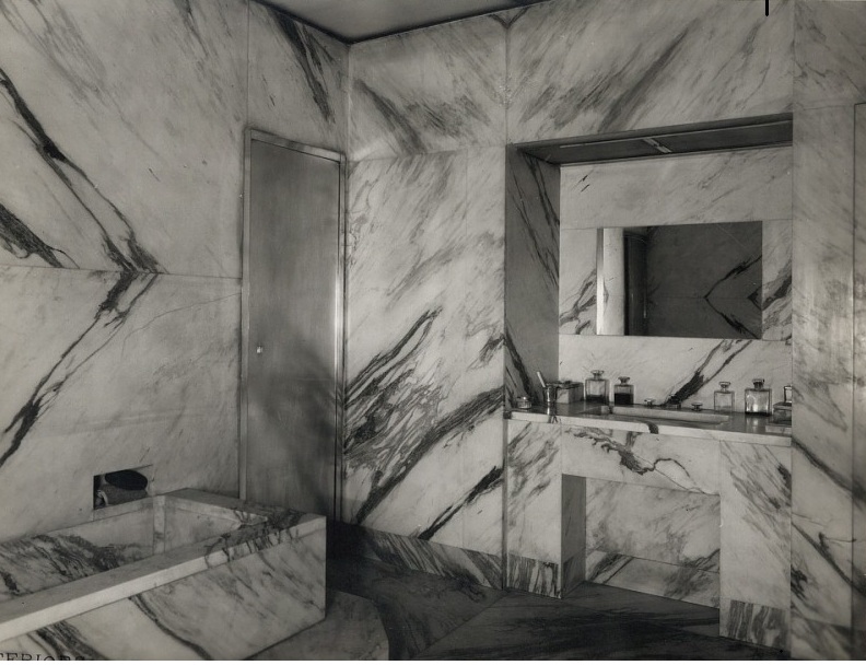
Marble Bathroom Interior – Frank’s restraint in proportion, surface and control
Frank’s Material Restraint
Jean-Michel Frank was born in Paris in 1895 into a German Jewish family. His life was marked by trauma, loss and displacement. His brothers died fighting for France in the First World War, and his father later took his own life under immense pressure, leaving his mother suffering from severe depression. Frank himself left France as Europe darkened under Nazism and died in New York in 1941, aged only 46. Accounts of his death have varied, but later biographical readings point to suicide by overdose, while his adult life is often described as having been shadowed by depression, illness and opiate addiction.
However, to read his work entirely through that tragedy is reductive, because Frank was not merely a wounded figure. He was also a brilliant editor of space, a man of the Parisian avant-garde, a collaborator, a traveller, a friend of artists and patrons, and one of the most quietly radical interior designers of the twentieth century.
He is often described as a minimalist, but that word can mislead, because his rooms were not minimalist in the contemporary white-box sense, nor were they empty for the sake of purity. They were stripped back so that material could become more intense, and the conscious choice of removing the unnecessary allowed Jean-Michel Frank the space to deepen what remained.
His furniture was often simple in outline: square chairs, low tables, severe cabinets, clean planes, unadorned profiles. But those unadorned and merely functional forms were given extraordinary skins, and this was the paradox that allowed his work to shine.
Art Deco Without the Noise
Frank belonged to the wider world of Art Deco, but not to its most lacquered, jewel-like or theatrical branch. He was adjacent to modernism, but he was never a doctrinaire machine-age designer. He moved among artists connected to Surrealism and the Parisian avant-garde, yet his interiors were not manifestos.
His world included patrons such as Marie-Laure de Noailles, Eugenia Errázuriz, Elsa Schiaparelli, Templeton Crocker and Nelson Rockefeller. Around him were figures such as Alberto Giacometti, Christian Bérard, Salvador Dalí and Emilio Terry. His collaboration with Adolphe Chanaux gave him the workshop structure needed to translate refined, sometimes fragile ideas into objects and interiors of great precision.
That workshop relationship is crucial, because Jean-Michel Frank’s restraint depended not only on taste, but on the hands-on experimentation and technical skill needed to make difficult materials behave with precision. Ultimately, a parchment-lined room, a shagreen cabinet or a straw marquetry wall does not happen by taste alone; it needs structure, patience, substrate, hand, join, surface preparation, edge control and judgement.
Yves Saint Laurent, the French couturier, and Pierre Bergé, his partner in life and business, were among the great twentieth-century collectors to understand Frank’s severity as a form of refinement. Their Paris interiors placed Frank’s furniture among works by Picasso, Goya, Brancusi and Renaissance bronzes, not as background pieces, but as part of a highly controlled conversation between art, furniture and atmosphere. Christie’s noted that Saint Laurent and Bergé were among the first to collect Frank in the 1970s, which says a great deal about what they recognised in him: not nostalgia, but a modern austerity made sensual through proportion, rarity and surface.
One of the reasons Jean-Michel Frank remains important for architects and interior designers today is that his work reminds us of a vital principle, and it is this: to truly honour unusual or rare materials, one cannot assume that visual simplicity implies less technical knowledge or responsibility. On the contrary, it requires a deeper understanding of the material.
The following sections look at the materials most closely connected to Jean-Michel Frank’s world, and how each one speaks to De Ferranti’s own surface language today.
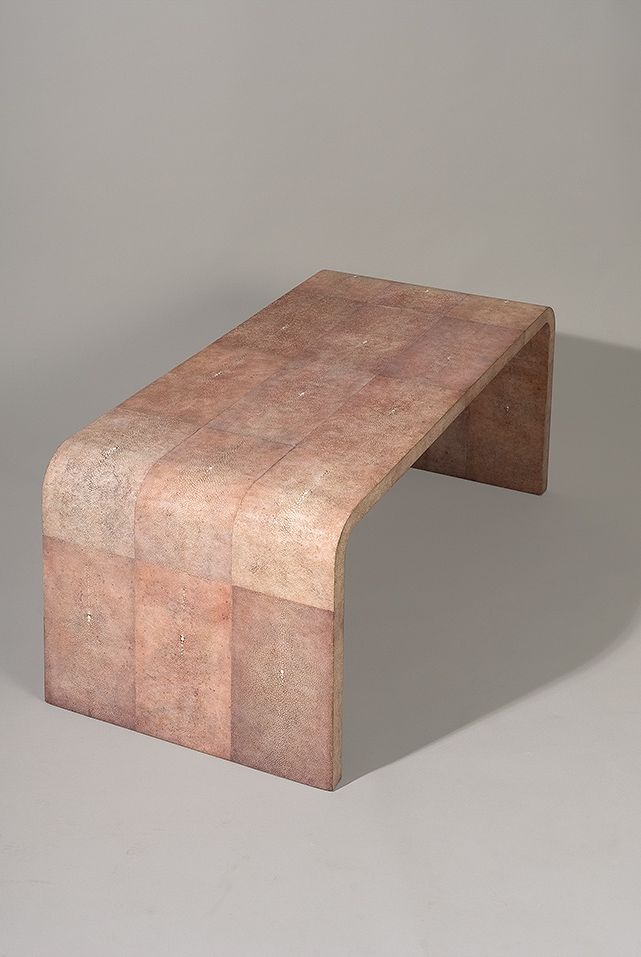
Shagreen Waterfall Table – Jean-Michel Frank – 1928
Shagreen and Galuchat
One of the materials most closely associated with Frank is shagreen.
Shagreen, (or galuchat in French decorative vocabulary), is decorative ray skin, often stingray, with a dense surface of tiny calcified beads. It has a long history in Asian and European decorative arts, appearing on sword hilts, scientific instruments, boxes, cases and precious objects. Frank gave it a new architectural and interior life by applying it to furniture, lighting and accessories in calm, broad planes.
I have always been fascinated by shagreen, partly because I first encountered it not as a modern surface, but on objects: old cases, spectacle boxes, pieces of paraphernalia that had a curious, tactile authority. I have an image of an opium pipe covered in galuchat from one of my antique books, and for me, this is exactly the kind of object that explains how a material can transform; first held in the hand, then re-imagined as a box, a cabinet, a wall, or a surface.
Frank seems to have understood that instinct completely. In his hands, shagreen did not feel like ornament applied to furniture, but instead, felt more as if a familiar object had become something completely new.
Shagreen, Ivory and Brass Bloc Table Lamp - Jean Michel Frank c. 1927
Specification and Uses
For contemporary specification, genuine shagreen remains a remarkable material, but it must be approached with discipline.
It is best suited to protected vertical or joinery applications: cabinet fronts, drawer faces, headboards, bar fronts, decorative panels, inlays, screens and furniture.
Its use requires careful hide selection, layout planning, seam control, edge treatment and traceability.
Interiors-grade stingray is normally applied as a skin over a stable substrate, so the performance of the finished panel depends on the hide, backing, adhesive, substrate and edge detail working together.
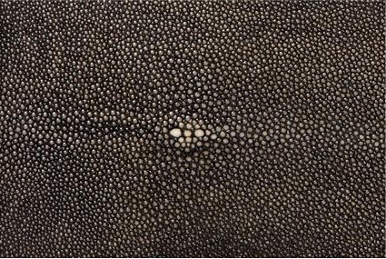
Shagreen Black-Skin Briquette - De Ferranti
Species identification and origin should be confirmed for genuine shagreen, with any relevant trade documentation checked before procurement.
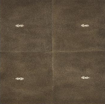
Faux Shagreen – Smoked Bronze Resin Tile - De Ferranti
Where material continuity or budget are a consideration, faux shagreen offers another option. A well-developed moulded resin surface can capture the visual rhythm of shagreen in a more repeatable form, particularly for larger areas where consistency, format, replacement and procurement control are important.
While faux shagreen does not have the biological individuality of genuine shagreen, it can be the more practical answer for certain interiors. When working with either type, designers should still ask for sample approval, cleaning guidance, chemical-resistance information where relevant, and fire or emissions data for the exact build-up.
Coffee Table - mica & ebony veneer - Jean-Michel Frank - c.1929
Mica and Mineral Light
A naturally occurring mineral formed in thin, layered sheets, mica is prized for its subtle shimmer, translucency and the unique way it seems to hold light rather than merely reflect it.
I first saw mica in the windows of old carriages that had carried the Tsars of Russia, in the Kremlin Museum, and that image stayed with me. It was clearly not glass, and had a mineral flicker; a layered, almost candlelit quality.
When I later saw that Jean-Michel Frank had used mica for furniture, it confirmed the possibility I had sensed. Frank’s mica tables are especially interesting here: by simplifying the architectural form of the table to its functional minimum, often with its top and sides wrapped in mica, the final object becomes less like a table with a finish, and more like a single, coherent mineral volume.
Section of an Opus Mica Table-Top - De Ferranti
Specification and Uses
Technically, mica is not a single decorative material but a family of sheet silicate minerals. Its natural cleavage allows it to split into thin leaves, which gives it its layered shimmer. In interiors, it is usually used as a laminated or assembled surface rather than as a raw mineral sheet placed directly into a scheme.
For architects and designers, mica should be specified as a light-reactive surface. Its beauty is not only in colour, but in the way it behaves under different conditions: raking light, low light, candlelight, shadow and movement. Mock-ups are especially important, since a mica surface may look completely different in a showroom, a daylight corridor, a dark bar, a powder room or a softly lit drawing room.
It suits niches, feature walls, cabinet faces, furniture, tabletops, decorative panels and atmospheric areas where its mineral depth can be appreciated.
It requires a flat and dimensionally stable substrate, protected exposed edges, careful fabrication and clear information about binder, backing, emissions and fire performance of the complete assembly. Mica is less forgiving at corners and arrises than it is across a flat plane, so transitions should be resolved early.
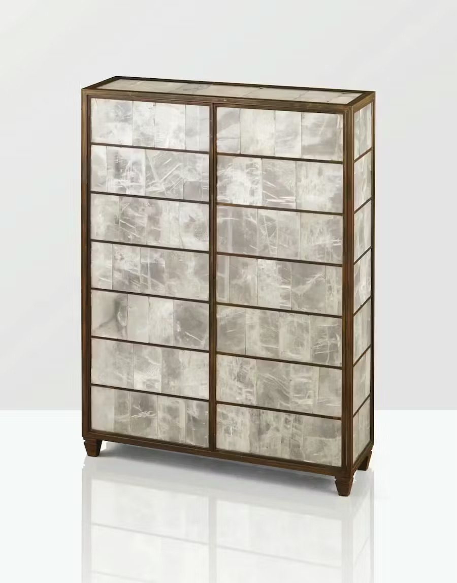
Selenite Cabinet - Jean-Michel Frank c. 1935
Selenite and the Softness of Stone
Selenite is a crystalline form of gypsum, often pale, luminous and soft in appearance. I have seen it used in lamps, tiles, doors, furniture and wall applications. Like mica, it becomes most interesting when one thinks of it not simply as cladding, but as a material that plays with light in unique ways.
Specification and Uses
Selenite is beautiful precisely because it is fragile, luminous and crystalline, yet those same qualities make it technically demanding. It is not a general-purpose stone, and is relatively soft, cleavable and vulnerable compared with marbles, limestones or dense decorative stones. For architectural use, it is best treated as a protected interior feature material, often as part of a laminated or composite assembly.
Its strongest applications are vertical and atmospheric: back-lit panels, reception desks, bars, niches, screens, doors, furniture, decorative walling and protected feature zones. Edges must be considered carefully. So must lighting, access, weight, backing, fixing and maintenance.
Full-size visual mock-ups, engineered shop drawings and early coordination with lighting and joinery teams are especially useful.
A successful selenite feature is not just a stone choice; it is a small lighting project, a fabrication project and a material judgement all at once.
Al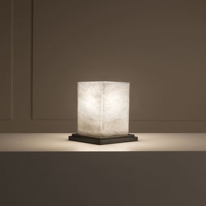
Cubic Lamp – Alabaster & Patinated Metal – Jean-Michel Frank c. 1925
Alabaster and the Carved Surface
Alabaster is a fine-grained mineral, usually a form of gypsum or calcite, valued for its smooth surface, subtle veining and exceptional suitability for carving. Softer and more workable than many stones, it has long been used for sculpture, vessels, architectural details and decorative objects, giving interiors a sense of hand-shaped refinement rather than mineral spectacle.
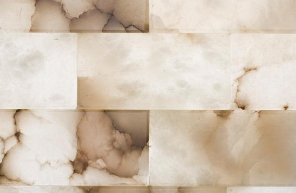
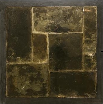
Alabaster Brick Art – De Ferranti
Specification and Uses
In contemporary interiors, alabaster is often most compelling when treated as a carved or shaped material rather than simply a translucent surface. It can be used for basins, plinths, sculptural lighting bodies, vanity details, fireplace surrounds, table bases, small columns, relief panels and decorative objects, where its softness, veining and hand-worked character can temper harder architectural lines.
But as with selenite, it should not be specified casually. Thickness, backing, panel size, lighting temperature, heat, moisture, support and access must all be resolved. The goal is to make the glow seem effortless, but the effort sits in the detailing. Designers should review samples both unlit and lit, since the same piece can read differently when seen as a surface and when used as a source of illumination.
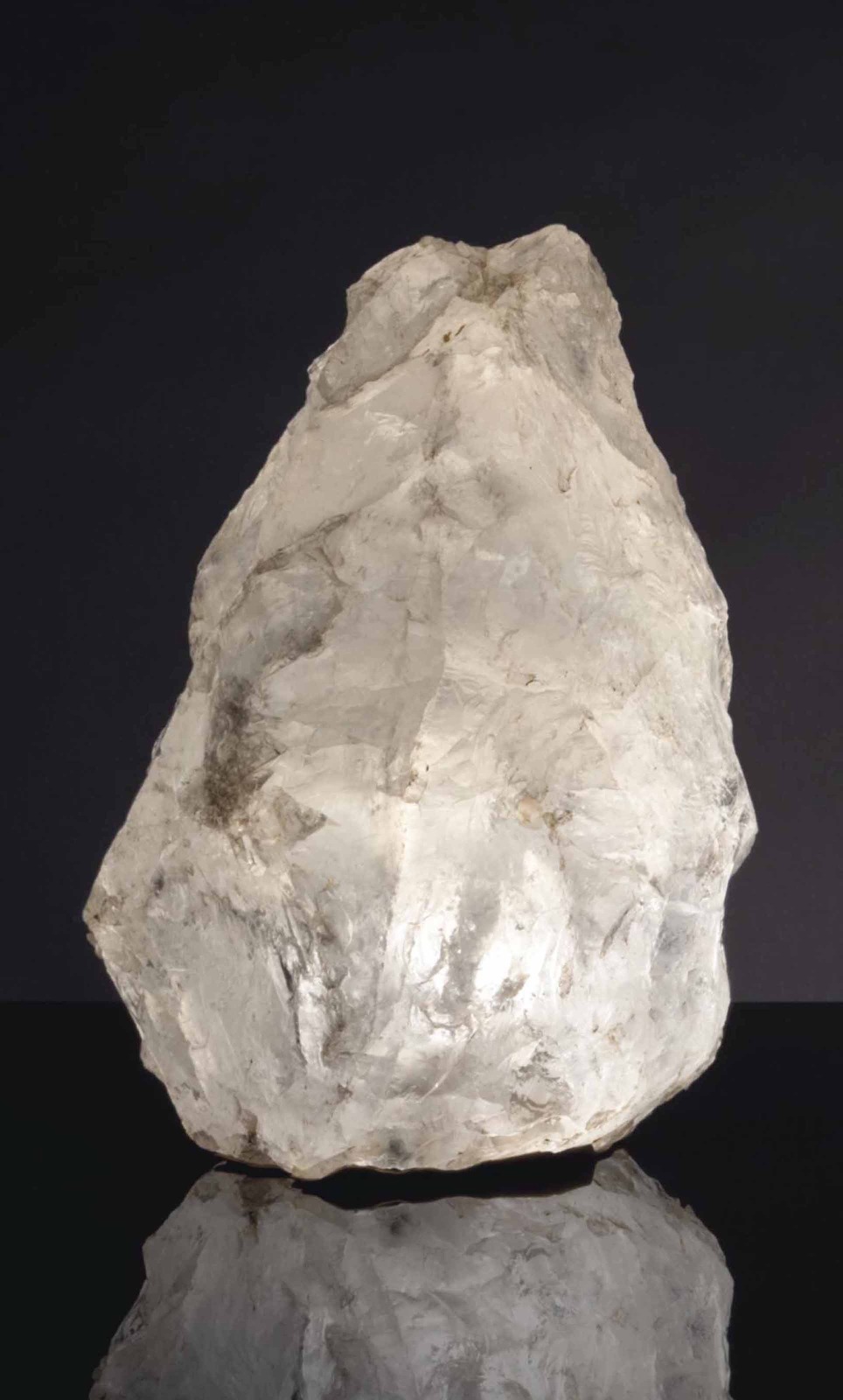
Table Lamp – Rock Crystal (Quartz) - Jean-Michel Frank, c. 1931
Rock Crystal and the Mineral Object
Rock crystal belongs to Jean-Michel Frank’s world because it sits somewhere between object, mineral and sculpture. It is the transparent or near-transparent form of quartz, often carrying natural inclusions, fractures, veils and internal irregularities that make each piece feel less manufactured than found. Unlike mica, which works through layered shimmer, or selenite, which has a softer crystalline delicacy, rock crystal has a more primitive authority: hard, cool, geological and almost talismanic.
Frank used rock crystal most memorably in lamps from the mid-1920s, often leaving the mineral in a rough-hewn state rather than refining it into polite perfection. Similar rock crystal lamps appeared in several of his interiors, including the Hôtel Bischofsheim for Marie-Laure and Charles de Noailles, where they were placed on side tables and sometimes directly on the floor. Their power came from contrast: a raw mineral body set inside a room of great discipline.
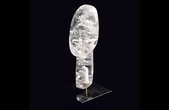
Rock Crystal Cycladic Head – De Ferranti
For De Ferranti, that is the most interesting lesson. Rock crystal does not need to become a conventional surface to belong in an interior. It can remain an object of density and presence: a base, a handle, a lamp body, a candelabra, a sculptural insert, a plinth detail, a table support or a small architectural punctuation within a larger scheme. Its attraction lies in the way it carries the memory of the earth into the room without becoming rustic.
Specification and Uses
Rock crystal is quartz, a hard mineral with a Mohs hardness of around 7, which means it resists scratching better than many decorative stones. It should not, however, be treated as indestructible. It can still chip, fracture or fail if struck, drilled poorly, left unsupported or fixed through a vulnerable point.
In interiors, rock crystal is best treated as a crafted mineral object or accent rather than a general cladding material. It suits lamp bodies, sculptural lighting bases, cabinet pulls, handles, finials, table bases, plinth inserts, candelabra, incense holders, fireplace accessories and jewel-like details within furniture or joinery.
Selection is central. Colour, clarity, inclusions, veiling, fracture lines, size, weight and shape should be reviewed from actual pieces or detailed photography. Fixings should support the crystal without forcing it into tension, and any drilling should be carried out by a specialist familiar with natural quartz. Cleaning should remain gentle, using soft cloths and non-abrasive methods.
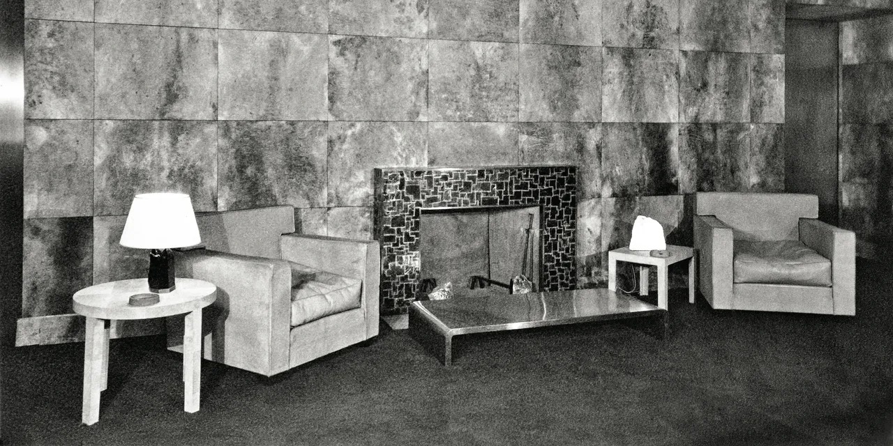
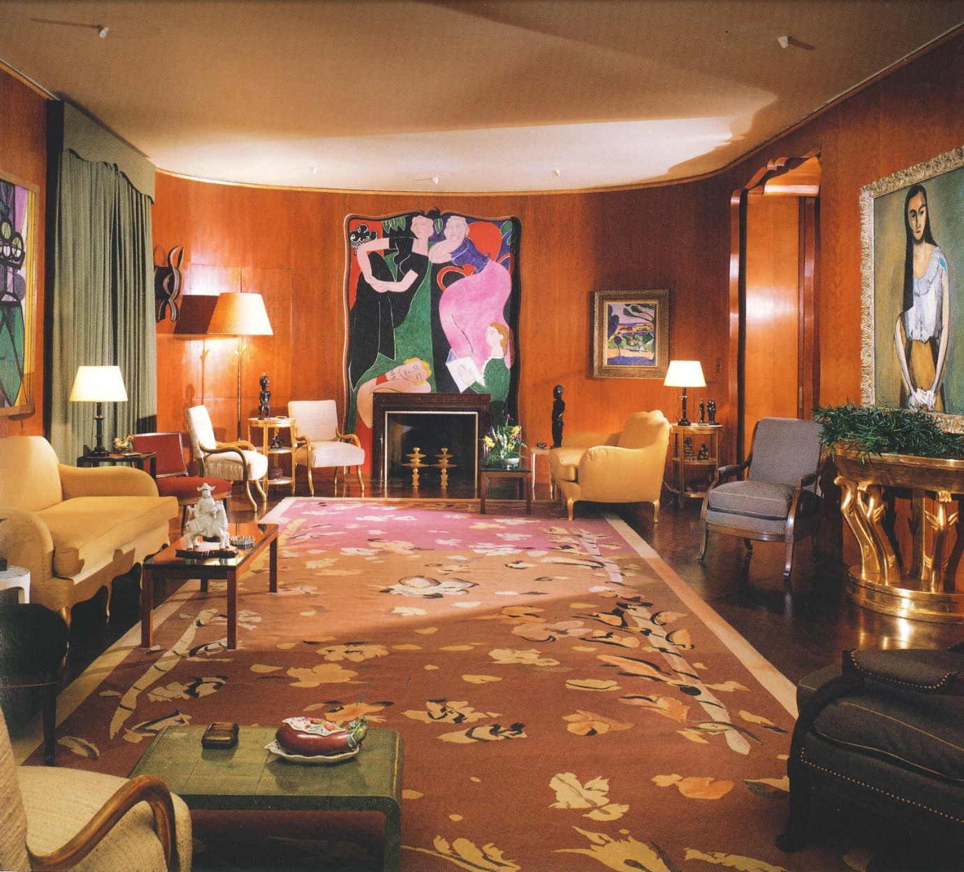
Templeton Crocker Penthouse Living Room - Parchment Walls, Mica Fireplace and Quartz Lamps - Jean-Michel Frank, c. 1929
Vellum, Parchment and Skin-Based Surfaces
Vellum and parchment occupy a more intimate register.
They are skin-based materials, meaning they are made from animal hide that has been cleaned, stretched, scraped and dried under tension rather than tanned like leather.
In broad terms, parchment refers to prepared untanned animal skin, while vellum is usually the finer grade, traditionally associated with calfskin, although the terms are sometimes used more loosely in decorative interiors.
Unlike woven fabric, paper or leather, vellum and parchment retain a distinctive density, translucency and natural irregularity from the original hide. Their surface may show subtle veining, tonal variation, follicle marks and cloudy movement, which gives them their quiet, organic warmth.
Historically, they are associated with manuscripts, bookbinding, lampshades, screens and refined decorative objects. Frank used them to extraordinary effect, particularly on walls, furniture and panels, where they created a soft, matte, chalky warmth.
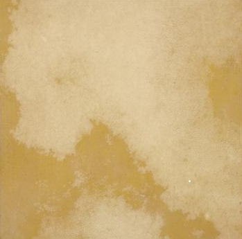
Vellum - Honey Wash Tile - De Ferranti
My own first experience of vellum or parchment was through lampshades, and I instantly loved the way light passed through the material, softened by its natural variation.
Specification and Uses
Vellum and parchment are not industrially uniform. They have natural markings, subtle tonal shifts and a warmth that cannot be replicated by ordinary paint or laminate. They can bring extraordinary softness to doors, panels, furniture, screens, walls, ceilings and cabinet fronts.
But they also require respect. They are sensitive to moisture, humidity, heat and substrate imbalance. They should be used in dry, conditioned interiors, backed properly, acclimatised carefully and detailed honestly. Seams, edges and panels should be treated as part of the design rather than hidden as if the material were a synthetic sheet.
When deciding whether to work with either vellum or parchment, clarity is essential in the specification process. It is important to establish if the finish is natural skin, paper-based, laminate-based or another engineered surface, since each has a different performance profile.
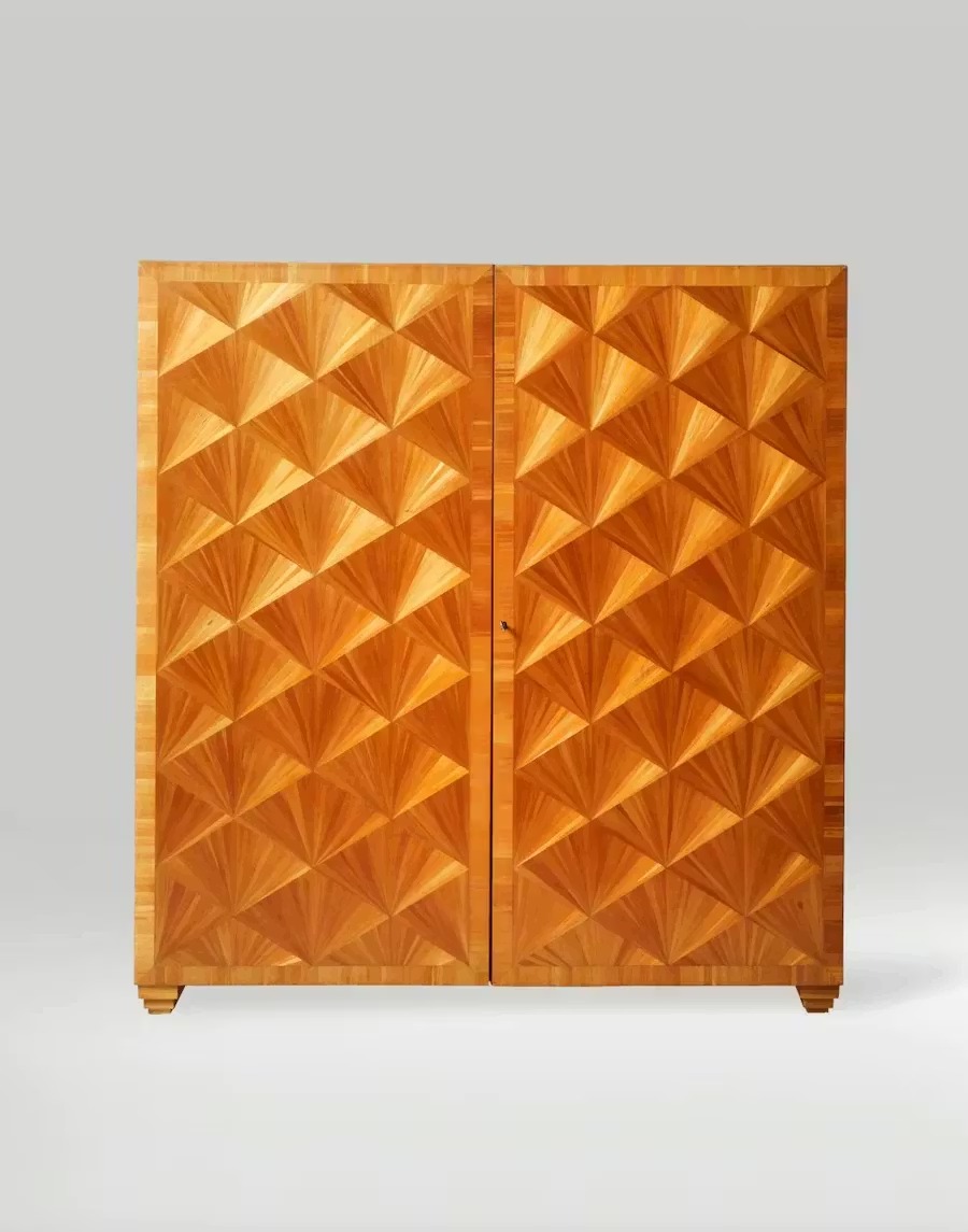
Straw Marquetry Cabinet - Direction, Repetition and Straw Marquetry - Jean-Michel Frank c. 1925
Straw Marquetry and Bamboo Reimagined
Straw marquetry was one of Frank’s most beautiful material languages. It turns an apparently modest agricultural material into a radiant surface. When split, flattened, arranged and burnished, straw can produce geometric patterns of extraordinary refinement: sunbursts, chevrons, squares, diamonds, fans and interlocking fields that shimmer as the viewer moves.
However, it bears noting that it is not always the most robust answer for contemporary architectural use, because true straw marquetry not only demands remarkable handwork, but is also delicate and expensive.
At De Ferranti, we work with bamboo marquetry, which offers a way to continue the visual logic of straw marquetry while using a material that can be more hard-wearing and more practical for modern interiors. Bamboo is a rapidly renewable material, and when cut, arranged and worked with care, it can create directional shimmer, linear movement and geometric pattern in a way that recalls straw without pretending to be it.
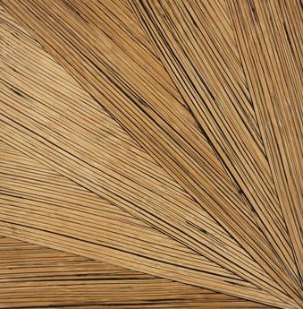
Bamboo Fan Panel with Black Grout – De Ferranti
Patterns such as sunbursts, triangles, interlocking squares and basketweaves can be interpreted in bamboo with a strong decorative rhythm, with results sitting somewhere between Jean-Michel Frank’s genuine straw marquetry, Asian craft traditions and contemporary architectural panelling.
Specification and Uses
For specification, bamboo marquetry behaves more like a wood or grass-based veneer or panel than a ceramic or stone. It needs acclimatisation, stable indoor conditions, balanced construction, appropriate backing, movement allowance and suitable adhesives.
It is well suited to console tables, sideboards, drinks cabinets, bedside tables, drawer fronts, writing desks, coffee tables, occasional tables, wardrobe panels, shelving units, vanity units, headboards and decorative insets within larger joinery pieces. In some cases, specialist techniques may allow more demanding uses, but these need to be assessed project by project.
Design teams should consider pattern direction, panel sizing, substrate, reverse-balancing, edge sealing, finishing and service conditions before order. Bamboo can be more robust than straw marquetry, but it remains a crafted natural material and should not be treated as a commodity board.
Metal, Pattern and Patina
Frank’s material world also brings us to metal, particularly through his association with Alberto Giacometti, a Swiss sculptor, painter and designer later known as one of the most important sculptural figures of the twentieth century.
Giacometti’s work brought a rougher, more archaic and sculptural counterpoint to Frank’s restraint, creating lamps, sconces, objects and decorative pieces that gave Frank’s pale, pared-back interiors a darker, more tactile intensity.
At De Ferranti, patinated and embossed metalwork belongs naturally to this line of thinking. Metal can be too slick when treated only as polish. It becomes far more interesting when it is worked or given a surface that catches shadow. Embossed patterns, patination, hand-finishing and relief can turn metal into an architectural skin rather than a simple sheet.
Specification and Uses
Technically, metal specification needs attention to patina stability, lacquer or wax protection, fingerprints, cleaning method, substrate, movement, fixings and edge detail.
It is worth noting that in commercial or hospitality settings, the selected finish must be assessed for wear, impact, maintenance and reaction to cleaning regimes.
Where a living finish may continue to change, a sealed finish may be more stable but less sensuous. The correct answer depends on the room, the level of touch, the degree of maintenance required and whether the client prefers a surface that stays controlled or one that continues to acquire character.
Specification Lessons from De Ferranti
When working with any of the materials mentioned in this blog, the lessons below should be read as a quick summary of key principles that we at De Ferranti have learned in practice.
Treat the assembly as the product. A surface is rarely just a surface; it is a finish, adhesive, backing, substrate, edge detail, joint and maintenance regime. Fire performance, emissions and durability should be confirmed for the complete build-up, not for a related material in isolation.
Resolve transitions early. These materials usually reveal weakness at edges, corners, seams, reveals, pull points and junctions, not in the middle of a perfect sample. The drawing of the edge can be as important as the choice of the material.
Approve samples under project lighting. The same material can change significantly between showroom light, daylight, candlelight and a softly lit interior.
Distinguish natural from engineered. Genuine shagreen is not faux shagreen; natural parchment is not an engineered parchment-like laminate, and bamboo marquetry is not straw marquetry. Whether natural or engineered, each material has its own truth, performance profile and procurement logic.
A Final Word from Alvaro de Ferranti
When I look back at what Jean-Michel Frank gave me, it was not simply an admiration for his rooms, though I do admire them deeply. It was a way of seeing.
He made me understand that surfaces could be soulful without being sentimental, luxurious without being loud, simple without being plain; his work taught that the most powerful interiors are often the ones where every material has been given room to breathe.
That has influenced the way I look at everything, always from a standpoint of curiosity in discovering what else a particular material might become.
At De Ferranti, that question remains central. More than offering a mere product catalogue, we are curators of possibilities, and while we do search for rare and unusual surfaces, rarity alone is never enough. The surface must have presence, craft, but above all, the ability to change the feeling of a room. Frank’s work reminds me that the quietest material, used with craft, creativity, and proper specification, can sometimes be the most unforgettable.
CPD Template for Architects
CPD Template for Architects
Logging This as CPD
If relevant to your role, current projects or wider professional development, this article may be recorded as self-directed or unstructured CPD.
Suggested Core Topic
Jean-Michel Frank, material restraint and the architectural specification of rare, tactile and crafted interior surfaces.
Suggested Learning Format
Self-directed reading.
Estimated Reading Time
18-22 minutes.
This Article Covered
The design influence of Jean-Michel Frank and his role in shaping a quieter, materially intense form of twentieth-century interior design.
The distinction between Frank’s reductive luxury and more conventional readings of Art Deco, modernism or minimalism.
The role of Frank’s collaborators, patrons, makers and later collectors in establishing the continuing relevance of his work.
The importance of workshop skill, experimentation and technical execution in making restrained interiors work successfully.
How Frank used materials such as shagreen, mica, selenite, alabaster, rock crystal, vellum, parchment, straw marquetry, bronze and textured metalwork.
How De Ferranti’s related material families, including bamboo marquetry, genuine shagreen, faux shagreen, mica, selenite, alabaster, rock crystal, vellum, parchment and patinated metalwork, can be understood in relation to Frank’s material language.
The difference between natural and engineered interpretations, including genuine shagreen versus faux shagreen, natural parchment versus engineered parchment-like finishes, and straw marquetry versus bamboo marquetry.
The importance of treating rare finishes as complete assemblies involving surface, backing, adhesive, substrate, edge detail, jointing, fixing and maintenance.
Key specification considerations for skin-based materials, mineral surfaces, translucent materials, carved or sculptural stone objects, marquetry-based panels and patinated metalwork.
The need to assess samples under project lighting, rather than relying solely on showroom conditions or photography.
The role of mock-ups, edge detailing, environmental stability, fire performance, emissions data, responsible sourcing and maintenance expectations in the specification of unusual surfaces.
The value of translating historical craft references into contemporary architectural applications without reducing them to imitation or nostalgic reproduction.
Suggested CPD Record Summary
This article developed my understanding of Jean-Michel Frank’s influence on material restraint and the architectural use of rare, tactile and crafted surfaces. It explored how Frank used shagreen, mica, selenite, alabaster, rock crystal, vellum, parchment, straw marquetry and metalwork to create interiors of quiet intensity. It also connected those ideas to De Ferranti’s contemporary material language, including bamboo marquetry, genuine and faux shagreen, mineral surfaces, translucent materials, carved or sculptural stone objects, vellum, parchment and patinated metalwork.
The article clarified practical specification considerations around substrates, backing, edge protection, lighting, environmental stability, mock-ups, material variation, fire data, maintenance and the distinction between natural and engineered materials. It reinforced the principle that visual simplicity does not reduce technical responsibility, but requires deeper knowledge of the material and its complete build-up.
Suggested Reflection
How might Jean-Michel Frank’s approach to restraint, proportion and material intensity affect my own specification of rare or unusual surfaces? In what kinds of projects could tactile, translucent, mineral, skin-based, carved, marquetry or patinated materials create atmosphere without relying on overt ornament? What technical checks would be needed before specifying these materials in a live architectural project?
Please Note
This content is intended for independent professional learning and should not be treated as accredited CPD unless expressly stated otherwise.
CPD Template for Interior Designers
CPD Template for Interior Designers
Where relevant to your professional practice, this article may be useful to log as self-directed or unstructured CPD.
Suggested CPD Record
Date completed: [DD/MM/YYYY]
Activity title: Jean-Michel Frank, De Ferranti, and the Elegant Possibilities of Rare Surfaces
Provider / publisher: De Ferranti
Format: Online article / self-directed reading
CPD category: Unstructured CPD
Estimated Reading Time: 18-22 minutes
Link: [Insert article URL]
What Did You Learn?
This article explored how Jean-Michel Frank used rare surfaces to create interiors of restraint, atmosphere and material depth. It showed how materials such as shagreen, mica, selenite, alabaster, rock crystal, vellum, parchment, straw marquetry and metalwork can shape a room through touch, proportion, surface character, light behaviour, texture and craft.
It also clarified how De Ferranti’s related material families can be considered for contemporary interiors, including bamboo marquetry, genuine shagreen, faux shagreen, mica, selenite, alabaster, rock crystal, vellum, parchment and patinated metalwork.
Why Is This Relevant to Your Practice?
For interior designers, the article is relevant because it connects material storytelling with practical design decisions. It shows how unusual surfaces can bring quiet richness, tactile interest, historical resonance and a stronger sense of material identity to a room.
It is especially useful when considering interiors that require atmosphere without visual clutter, or where a single material gesture needs to carry weight, softness, luminosity, pattern, texture or sculptural presence.
The article also helps distinguish between natural and engineered options, such as genuine shagreen versus faux shagreen, natural parchment versus engineered parchment-like finishes, and straw marquetry traditions versus bamboo marquetry.
Actions / Follow-Up
Review whether materials such as mica, selenite, alabaster, rock crystal, vellum, parchment, bamboo marquetry, shagreen, faux shagreen or patinated metal could support current or future project concepts.
Consider where light-sensitive or tactile materials could be used to shape atmosphere, especially in bars, dining rooms, powder rooms, dressing rooms, reception spaces, studies, libraries, private lounges, bedrooms, yachts and highly crafted residential interiors.
Consider where carved or object-like materials, such as alabaster or rock crystal, may be more appropriate as sculptural details, lighting bodies, handles, table bases, plinths, fireplace accessories or decorative objects rather than general surface cladding.
Request samples and review them under project lighting rather than relying only on showroom conditions or photography.
Discuss substrate, backing, seam position, edge detail, fixing method, maintenance expectations and environmental conditions early with the supplier, fabricator or installer.
Consider whether a natural material, an engineered interpretation or a more repeatable faux alternative is the most appropriate answer for the project.
Please Note
This content is intended for independent professional learning and should not be treated as accredited CPD unless expressly stated otherwise.